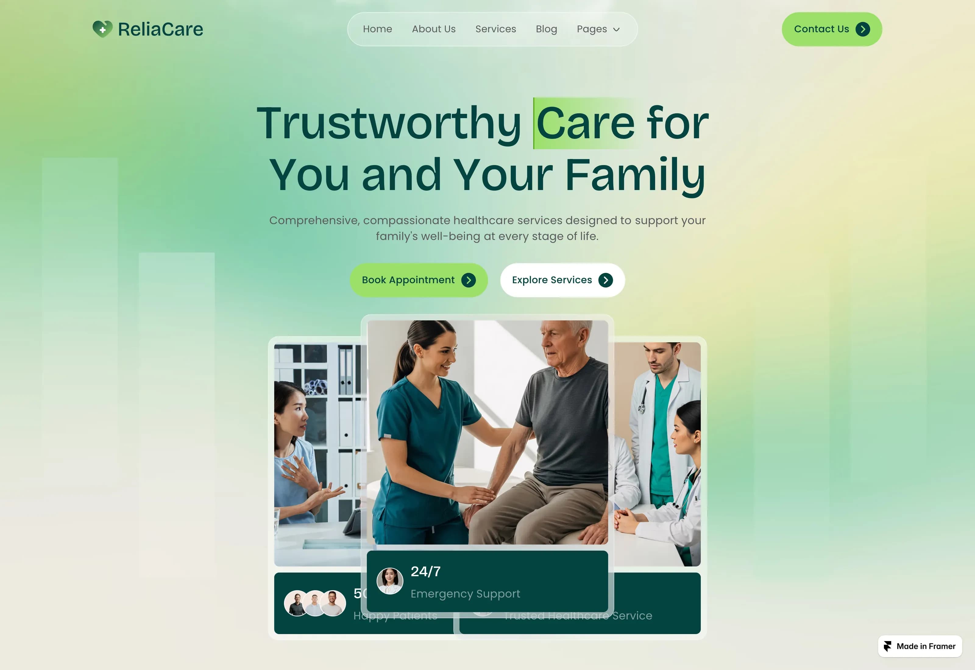
Fontshare is a free font library from the Indian Type Foundry, and it is one of the best-kept secrets in web design. While most designers default to Google Fonts, Fontshare offers a growing collection of professionally designed typefaces that are free for commercial use, with a licensing model that is actually simpler than Google's in some ways. We've been using Fontshare fonts in our website templates for a while now, and the pattern we keep seeing is this: designers discover it, try one font, and then gradually shift half their projects over. This review covers what Fontshare is, how to use it, and the specific fonts we reach for most often.
A quick note on licensing: every font on Fontshare is free for personal and commercial use. You can embed them in websites, use them in client work, and include them in products you sell. There is no pageview limit, no separate web license, and no attribution requirement beyond keeping the license file with the font files. That simplicity alone makes it worth bookmarking.
What is Fontshare and who runs it?
Fontshare is a free font distribution platform launched by Indian Type Foundry (ITF), one of the largest type foundries in the world. ITF designs custom fonts for global brands, and Fontshare is their way of releasing selected families to the public at no cost. The fonts are not amateur work; they are full-featured families with multiple weights, extensive character sets, and professional kerning.
The platform is simple. You browse, download the font files or grab a CDN link, and use them. There is no account required for basic use, though you can sign up for updates. The fonts are available in TTF, WOFF, and WOFF2 formats, which covers both desktop design and web embedding. Fontshare also includes a type tester, so you can preview your own text in any font before downloading.
Compared to Google Fonts, Fontshare is smaller but more curated. Google Fonts has over 1,400 families; Fontshare has a few hundred. The tradeoff is that Fontshare fonts tend to be more distinctive, and the overall quality bar feels higher because every family is designed by a single professional foundry rather than a mix of sources. For designers who want something beyond the default look of the web, Fontshare is a natural next step.
How do you use Fontshare fonts in a project?
Using Fontshare is straightforward. You have two options: self-host the font files or use the Fontshare CDN. For most web projects, the CDN is the fastest path. You copy the link provided on the font's page, paste it into your HTML head, and reference the font family in your CSS. It works exactly like Google Fonts.
For performance-critical projects or sites where you want full control over caching, self-hosting is the better choice. Download the WOFF2 files, upload them to your server or your template's asset folder, and define them in a @font-face declaration. Fontshare provides all the weights as separate files, so you can subset and only load the weights you need. That is a real advantage for speed.
For designers working in Figma or Framer, the TTF files install locally like any other font. We use Fontshare fonts in our Framer templates regularly, and the process is identical to using any paid font family. If you want specific pairing ideas, our Framer font pairing guide includes combinations we have tested with Fontshare families.
Fontshare feature overview
Feature | Fontshare | Google Fonts | Notes |
|---|---|---|---|
Cost | Free | Free | Both are free for commercial use |
Commercial use | Yes | Yes | Fontshare requires keeping license file |
Pageview limits | None | None | Both are unlimited for web embedding |
CDN available | Yes | Yes | Fontshare CDN is fast but smaller network |
Self-hosting | Yes | Yes | Fontshare provides WOFF2 files directly |
Account required | No | Optional | Fontshare lets you download without signup |
Curation | Single foundry | Multi-source | Fontshare feels more cohesive in style |
Font tester | Yes, with custom text | Yes | Both let you preview your own copy |
Desktop formats | TTF, OTF | Variable fonts | Fontshare lacks variable font support currently |
Total families | ~200+ | ~1,400+ | Google Fonts is larger; Fontshare is more selective |
What are the best Fontshare fonts for web design?
These are the fonts we use most often in our own templates and client work. Each one is a full family with multiple weights, and all are free for commercial use.
Poppins
Poppins is a geometric sans-serif with a friendly, approachable tone. It has become one of the most popular fonts on Fontshare, and for good reason. The round forms and consistent stroke width make it readable at small sizes while still distinctive at display sizes. It comes in 9 weights from Thin to Black, and it supports a wide range of languages including Latin and Devanagari.
Who it's for: Startups, SaaS companies, education platforms, and any brand that wants a modern, clean look without feeling sterile. We use Poppins in education and SaaS projects because it strikes a rare balance: professional but warm.
Standout specifics: The Black weight is genuinely usable for headlines, not just a marketing weight. The Devanagari support is excellent for projects targeting Indian markets. The x-height is generous, so it works well for body text even at smaller sizes.
Satoshi
Satoshi is a neo-grotesque sans-serif that feels like a refined Helvetica alternative. It has the clean, neutral structure that works for almost any project, but with subtle details in the letterforms that keep it from looking generic. The family includes 9 weights plus italics, and it covers a broad Latin character set.
Who it's for: Agencies, portfolios, consulting firms, and professional services. Any project where the design needs to look expensive without the font calling attention to itself. We use Satoshi in consulting and professional services projects where a clean, neutral tone works best.
Standout specifics: The italic is a true italic, not just a slanted roman, which makes it genuinely useful for emphasis and quotes. The spacing is tight and consistent, so it pairs beautifully with wide-tracking display fonts. The Medium weight sits in a sweet spot for subheadings that need presence without shouting.
Jakarta Plus (Plus Jakarta Sans)
Plus Jakarta Sans is a geometric sans-serif originally designed for the Jakarta city government, then expanded into a full family. It has a slightly more mechanical, engineered feel than Poppins, with straight terminals and a consistent rhythm that feels orderly and precise. It is available in 7 weights with matching italics.
Who it's for: Tech companies, fintech, Web3 projects, and any brand that wants to signal structure and precision. We reach for Jakarta when a project needs to feel systematic, like tech dashboards or AI startup interfaces.
Standout specifics: The design has a subtle squareness in the letterforms that reads as modern and technical without being cold. The tabular figures are well-designed, so it works for data-heavy interfaces. The letter spacing is slightly loose by default, which makes it excellent for all-caps treatments.
Be Vietnam Pro
Be Vietnam Pro is a sans-serif designed for Vietnamese language support, but it works beautifully for Latin text as well. It has a humanist character with slightly flared strokes and a lively rhythm. The family includes 7 weights with italics, and the character set is extensive.
Who it's for: Editorial sites, health and wellness brands, coaching platforms, and any project that needs a font with warmth and personality. We use it in coaching and wellness projects where the tone needs to feel personal.
Standout specifics: The Vietnamese and extended Latin support is exceptional, making it ideal for international projects. The italic has a calligraphic quality that feels genuine. The Regular weight is slightly heavier than average, which improves readability on screens with lower resolution.
Clash Display
Clash Display is a bold, high-contrast display font with a strong editorial personality. It is not a body text font, but for headlines, hero sections, and large statements, it is one of the most impactful free options available. It comes in 6 weights.
Who it's for: Fashion brands, creative portfolios, entertainment sites, and any project that needs to make a bold visual statement. We use it in portfolio and entertainment projects when the headline needs to carry the design.
Standout specifics: The contrast between thick and thin strokes is dramatic without being fragile. It works at very large sizes and still holds its shape. The spacing is intentionally tight, so it works well for short, punchy headlines rather than long sentences.
Boska
Boska is a serif with a strong editorial feel, inspired by classic typefaces but drawn with modern proportions. It has sharp serifs, high contrast, and an elegant structure that reads as luxury without feeling stuffy. The family includes 4 weights with matching italics.
Who it's for: Luxury brands, editorial publications, architecture portfolios, and high-end services. It is a direct competitor to paid luxury serifs, and it holds its own. We pair it with clean sans-serifs in architecture and luxury-focused work.
Standout specifics: The italic is beautifully drawn with real cursive structure. The contrast between regular and bold is strong enough to create real hierarchy. The letterforms are slightly condensed, so it works well for tight layouts without sacrificing readability.
Space Grotesk
Space Grotesk is a proportional sans-serif with a grotesque structure and slightly quirky details. It is an evolution of the original Space Mono, redesigned with proportional spacing for better readability in body text. It comes in 5 weights.
Who it's for: Tech startups, developer tools, creative agencies, and any brand that wants a slightly unconventional but still readable tone. We use it in startup and tech projects when the brand needs to feel smart and slightly unconventional.
Standout specifics: The slightly squared curves give it a technical feel without being cold. The Bold weight is dense and impactful for headlines. The monospace heritage shows in the even rhythm, which makes it excellent for interfaces with mixed text and data.
Outfit
Outfit is a geometric sans-serif with a rounded, friendly character. It has a softer feel than Poppins, with more open apertures and a relaxed rhythm. It is available in 9 weights.
Who it's for: Wellness brands, children's products, education platforms, and any project that needs to feel approachable and warm. It is one of our go-to alternatives when Poppins feels too sharp. We use it in education and friendly brand work.
Standout specifics: The rounded terminals make it feel genuinely friendly, not just neutral. The Light weight is usable for body text, not just display. The overall spacing is open, which helps readability at smaller sizes and on mobile screens.
How do Fontshare fonts compare to Google Fonts?
The two platforms are complementary, not competitors. Google Fonts is the default for a reason: massive selection, reliable CDN, excellent documentation, and broad language support. Fontshare is the specialist choice: fewer fonts, but higher average quality, more distinctive design, and a simpler licensing model for commercial work.
We keep both in our toolkit. For projects that need a safe, widely recognized typeface, Google Fonts is the answer. For projects that need to stand out, or where the client is tired of seeing Inter or Open Sans everywhere, Fontshare is the better starting point. Our Google font pairings guide covers the best of that library, and our free serif fonts post focuses on serif options from both sources.
One practical difference: Fontshare does not currently offer variable fonts, while Google Fonts has been pushing them heavily. For projects where weight interpolation matters, like animations or responsive design, Google Fonts has the edge. For static weight projects, Fontshare's individual files are easier to subset and control.
Frequently asked questions
Is Fontshare really free for commercial use?
Yes, every font on Fontshare is free for personal and commercial use. You can use them in client work, embed them in websites, include them in products you sell, and use them in branding. The only requirement is that you keep the license file that comes with the download. There are no pageview limits, no user limits, and no attribution required on the website itself. This is simpler than many Google Fonts licenses, which technically require including the license text when redistributing the font files.
Can I use Fontshare fonts in Framer or Figma?
Yes. Download the TTF or OTF files from Fontshare and install them on your computer. They will appear in Figma's font menu and Framer's font picker immediately. For published Framer sites, you can self-host the WOFF2 files or use the Fontshare CDN link. The process is identical to using any custom font. We use Fontshare fonts in our Framer templates regularly, and the workflow is seamless.
How does Fontshare compare to paid foundries like Fontspring or MyFonts?
Fontshare is smaller and more curated. Paid foundries offer thousands of fonts across every conceivable style, including exclusive designs you won't find anywhere else. Fontshare offers a few hundred families, all from Indian Type Foundry, but the quality is consistently high. For many web projects, Fontshare has more than enough options. For highly specific brand requirements or custom typefaces, paid foundries still have the edge. Think of Fontshare as a premium free tier, not a replacement for the entire commercial font market.
Start with Fontshare for your next project
Fontshare is one of the most useful free resources a web designer can have. The fonts are professionally designed, the licensing is genuinely simple, and the collection is focused enough that you can browse it without getting lost. Poppins, Satoshi, Jakarta, and the others in this review are not just good free fonts; they are good fonts, period.
We use them in our own templates and client work because they remove one layer of friction from the design process. If you are building a site in Framer and want to explore the options, start with our Google font pairings guide for proven combinations, or browse our free serif fonts post for serif alternatives. The right font is the one that fits the brand and the project, and Fontshare gives you more good options than most designers realize are free.