A podcast website is not just a place to list episodes. It is the hub where casual listeners become subscribers, where subscribers become supporters, and where potential guests or sponsors form their first impression of your show. The template you choose determines how smoothly that happens.
We build templates for creators, and the pattern we keep seeing is this: podcasters who treat their site as an afterthought struggle to grow. The right podcast website template solves this. The ones who invest in a clean, functional home for their audio see better engagement, easier monetization, and stronger brand recognition. This roundup covers ten podcast website designs that get it right, from templates you can launch today to the approaches the biggest shows in the world use.
Before we start, one clarification. This is about templates and site structures for podcasters. If you are looking for video-focused creator sites, our videographer website templates guide covers that angle.
What does a podcast website actually need to do?
Every podcast site has three jobs: play audio, grow the audience, and open doors. The play part is obvious. Visitors need to hit a play button and hear an episode without friction. The grow part means RSS feeds, email capture, and links to every platform where someone might subscribe. The open doors part is about sponsors, guests, and press: they need to understand your show, your audience, and your value in under a minute.
Most podcasters over-index on the first job and ignore the second two. A beautiful episode player with no subscribe button is a leaky funnel. A gorgeous about page with no media kit is a missed opportunity. The templates in this guide solve all three.
Which DiverseKit templates work best for podcasters?
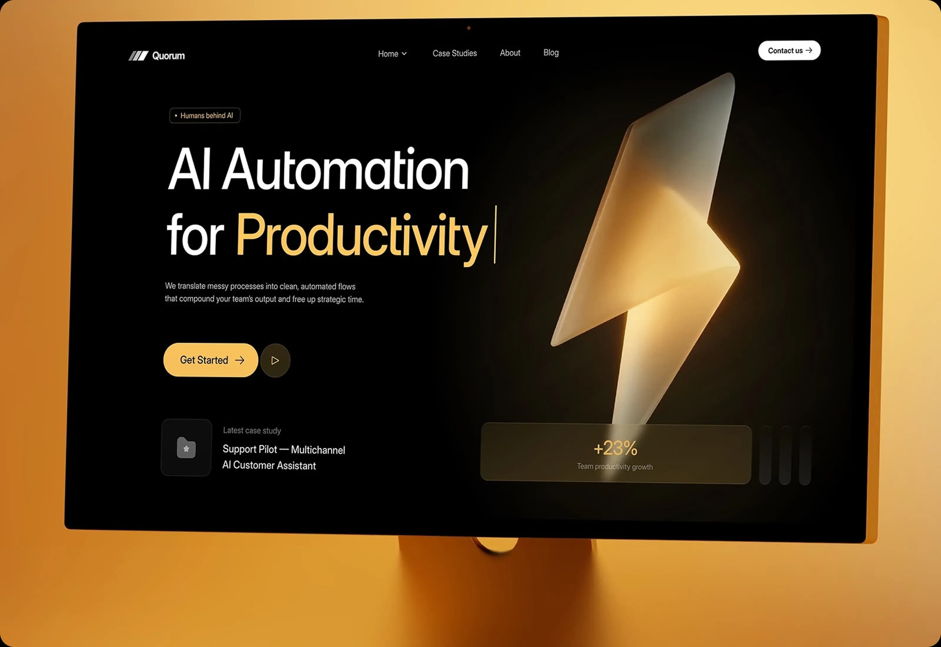
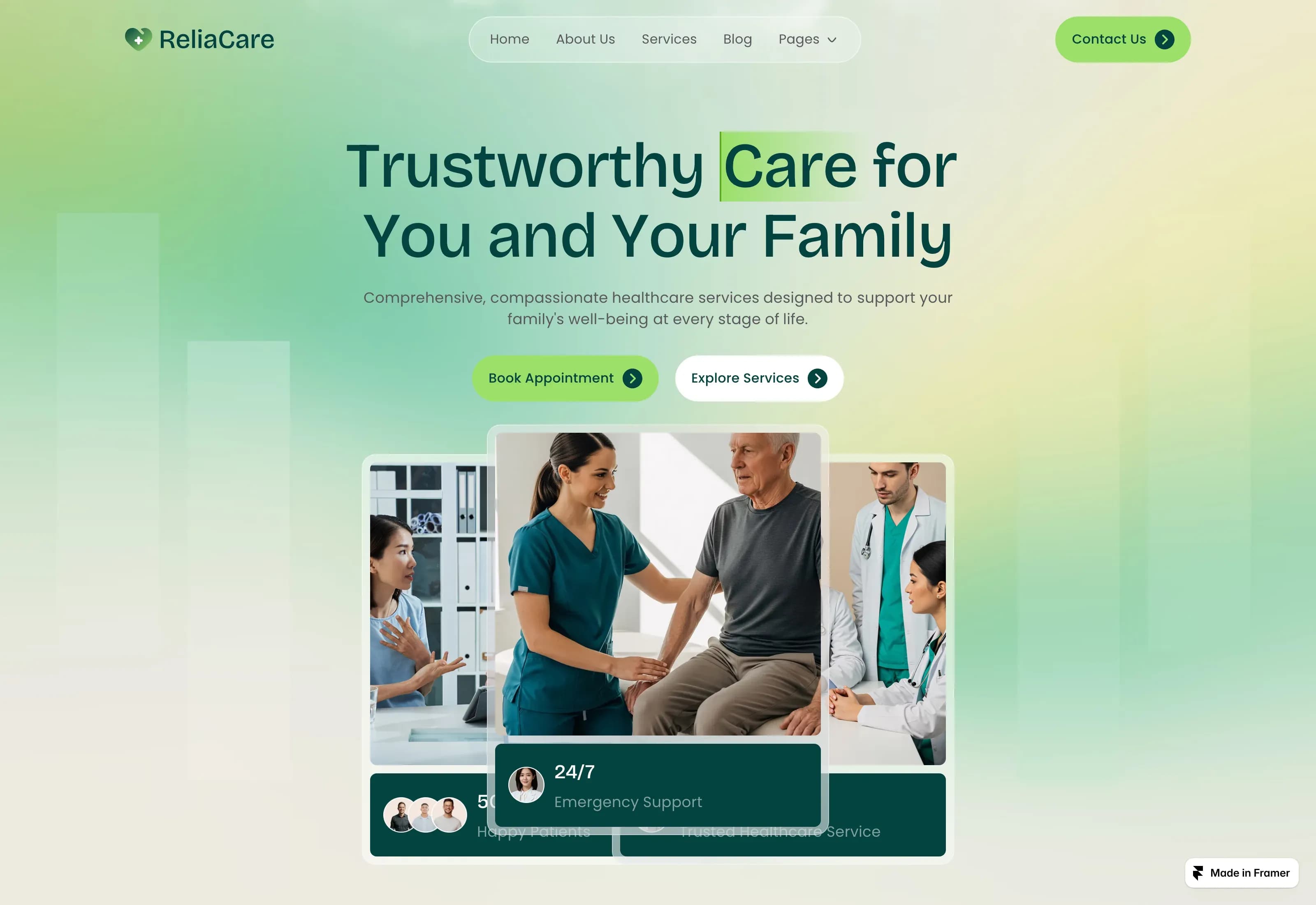
If you are looking for a podcast website template, we design two that podcasters consistently adapt for their shows. Both are Framer templates with Figma files included.
LISYN
LISYN ($49) is built for radio, podcast, and professional services brands. It includes a dedicated episode section with player integration, a host profile area, and subscribe buttons that connect to Apple Podcasts, Spotify, and RSS. The typography is clean and readable, and the dark mode option suits audio brands that want a studio feel.
Who it's for: podcasters with a regular release schedule who want listeners to binge episodes. The episode grid layout makes discovery easy.
Standout specifics: built-in episode player styling, RSS feed integration, host bio section with social links.
VOWEL
VOWEL ($69) is a wedding, photo, and portfolio template, but podcasters with a strong visual identity love it. The large image areas work well for cover art, guest portraits, and behind-the-scenes photography. The editorial layout gives each episode a magazine-like presentation.
Who it's for: podcasters who produce video episodes, have professional cover art, or want their site to feel like a premium publication.
Standout specifics: editorial grid for episode features, large image areas, elegant typography that suits long-form content.
Both templates are available in our video template category, and you can see the full range of creative templates at our template hub. For more on what makes a landing page work, see our landing page design best practices.
What do the best independent podcast sites get right?
The biggest shows in the world use custom builds, but their structural choices are worth copying. Here are eight podcast website designs that illustrate the patterns every show should consider.
The Interview Archive
Shows like The Joe Rogan Experience built their sites around a massive, searchable episode catalog. The design priority is discovery: visitors can browse by guest, topic, or date, and every episode page links to the full transcript, video, and show notes. The lesson for template buyers: look for grid layouts with search and clear pagination.
Who it's for: interview shows with large back catalogs that want listeners to explore older episodes.
Standout specifics: guest search, episode grid with filtering, transcript links.
The Serialized Story
Serial proved that podcast websites can build suspense. Each season gets its own landing page, and episodes are presented in strict sequence with recaps and next-episode teasers. If your show has narrative arcs, your template should support season-based organization.
Who it's for: narrative podcasts with seasonal storylines that want to guide listeners through a structured journey.
Standout specifics: season landing pages, sequential episode ordering, recap and teaser sections.
The Newsroom Integration
The Daily from The New York Times keeps its podcast site minimal and fast. The design is sparse because the content is the draw: a single featured episode, a short description, and a subscribe button. No clutter. This approach works if your show already has strong brand recognition.
Who it's for: news and current events podcasts that publish frequently and want speed over ornament.
Standout specifics: single featured episode, minimal layout, fast load times.
The Lifestyle Brand
Call Her Daddy treats its podcast site as a lifestyle hub. Episodes sit alongside merch, tour dates, and community links. The design is bold, personality-forward, and unapologetic. If your podcast is your personal brand, look for templates with flexible sections beyond audio.
Who it's for: personality-driven podcasts where the host is the brand and the site needs to support multiple revenue streams.
Standout specifics: merch integration, tour dates section, community links.
The Expert Resource
The Tim Ferriss Show uses its site as a reference library. Every episode page includes detailed show notes, book recommendations, and links to resources mentioned in the conversation. The design is clean and text-friendly because the value is in the information density.
Who it's for: educational and interview podcasts that want listeners to return to episode pages as reference material.
Standout specifics: detailed show notes, resource links, book recommendation sections.
The Narrative Archive
This American Life built one of the most browsable podcast archives online. Episodes are searchable by theme, date, and contributor, and transcripts are prominent. The design is understated because the stories are the star. If you have a deep back catalog, archive functionality is non-negotiable.
Who it's for: long-running shows with hundreds of episodes that want listeners to discover content by theme.
Standout specifics: theme-based search, contributor credits, prominent transcripts.
The Conversation Hub
Armchair Expert uses its site to highlight the relationship between host and guest. Episode pages feature large guest portraits, quotable moments, and social sharing. The design feels casual and conversational, matching the show's tone. Personality-driven podcasts should prioritize host and guest imagery.
Who it's for: conversation podcasts where chemistry and personality are the main attraction.
Standout specifics: guest portrait features, quotable moments, social sharing integration.
The Founder Series
How I Built This structures its site around the companies and founders featured in each episode. Episode pages include company profiles, founder photos, and related episodes. The design is business-clean because the audience is professional. B2B podcasters should look for templates with strong case-study-style layouts.
Who it's for: business and entrepreneurship podcasts that serve a professional audience.
Standout specifics: company profiles, founder photos, related episode suggestions.
These eight approaches share one thing: the website is not an afterthought. It is a deliberate extension of the show's identity and value.
What should every podcast website include?
Before you pick a template, run it against this checklist. Every item here affects whether your site grows your show or just sits there.
If your template choice does not make these eight items easy to implement, keep looking. Our podcast landing page template and portfolio-ready podcast template both cover this checklist. Good podcast typography is readable at small sizes and works well on dark backgrounds. We often recommend clean sans-serifs from Google Fonts for podcast sites. If you need a broader marketing presence, our marketing templates can extend your brand beyond the podcast site.
How do you pick the right template for your show?
When choosing a podcast website template, start with your release pattern. Weekly interview shows need browseable episode grids. Serialized narrative shows need season-based navigation. Solo shows need strong host presentation. Video podcasts need visual templates that handle embedded video well.
Next, consider your growth stage. A new podcast needs subscribe buttons and email capture front and center. An established show with sponsorship needs a media kit and contact page. A premium subscription podcast needs gating and payment integration.
Finally, think about your technical comfort. Framer templates like LISYN and VOWEL require no code, and both include Figma files for customization. If you need to see how Framer works for content-heavy sites, our Framer CMS tutorial walks through the basics.
Frequently asked questions
What is the most important feature of a podcast website template?
The episode player and subscribe buttons. Everything else is secondary. If visitors cannot play audio and subscribe in two clicks, the template has failed its primary job. Look for templates that place these elements above the fold and make them visually prominent.
Should a podcast website include transcripts?
Yes. Transcripts improve accessibility for deaf and hard-of-hearing listeners, they help with SEO because search engines can index the text, and they serve listeners who prefer reading to listening. A good podcast template should include a transcript section or make it easy to add one.
Can I use a portfolio template for my podcast?
Yes, if your podcast has strong visual elements. Portfolio templates like VOWEL work well for video podcasts, shows with professional cover art, or podcasters who also create photography or visual content. The key is ensuring the template includes audio player integration and subscribe functionality.
Pick a template that lets your audio speak
Your podcast website is not a decoration. It is a tool for growing your audience, converting listeners to subscribers, and opening doors to sponsors and guests. The right template makes those jobs easier, not harder.
Start with the checklist above. If your current site is missing more than two items, it is time to upgrade. Browse our podcast templates or explore the full template collection to find a structure that fits your show. Your audio deserves a home that works as hard as you do.